Friday, July 30, 2010

Final Project: Designing a Magazine Cover


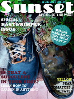
For our final project, we had to design a magazine cover. I chose to mimic my favorite magazine, Sunset Magazine, to display what I have learned in photoshop.

Project 12: Pop Dots


Pop dots are a great graphic tool to add texture to an image's background for design purposes. Here I took a burger photo from Pure Food Photography, a company I intern for, and made it a little more snazzy.

Project 11: Gaussian Blur


After walking around Paris all day, looking at museums, sitting in humid batobuses, squeezing through crowds, etc... makeup is sure to melt and hair goes flat. Thankfully due to photoshop, you can look as dewy and collected as you did in the morning.
In this image, I had been seeing the sites of beautiful Paris, not worrying about makeup and hair, yet when I got home, and especially now that I am looking at them 2 years later, wow did I need to powder my nose! Using the Gaussian Blur tool, I was able to slightly blur the image to give the essence of a dewy lens fogged by the morning moisture, and a soft glow effect. With a little adjusting of the layers, my photo is once again appreciated... remind me to never go blonde again.

Project 10: Photo Restoration

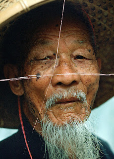
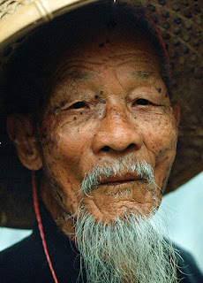
Poor Bluebeard, life handed him a couple curve balls. A bad eye, a big mole, and big scratches all over his portrait, he is not doing so hot... But that's okay because we have photoshop to make him look good again.
I first took the healing brush tool and painted over his mole. by setting a source point prior to this, it covers the blemish like it was never there. I then repeated this with all of the scratches, setting source points where it wasn't scratched, then painting over the scars. On one of the scratches I selected using the cloning tool, and corrected that way. To correct his poor blind eye, I opened the clone source palette, set the settings, clicked on a source point on the good eye, and then began painting over his bad eye.
No more looking like the victim of sun damage and an angry crow in the fields; onward to looking like the wise guru of gardening once more!

Saturday, July 24, 2010

Project 9: The Pen Tool


In this project had to make a surreal themed composite image using a collection of vector shapes made using the pen tool. For mine, I used the pen tool for selecting and then warping various face parts floating in the sky with glowing cubes. My friend on the beach seems to be very confused as to why there would be such a thing floating above her, and rechecks the ingredients in her vitamin bottle. :)

Project 8: Retouching


This project was great because there are so many times when I am out and about with no fancy reflectors, bad sun angles, and I have a killer composition....if only it was 10am, with a soft light and the sun was slightly higher. Oh dear. So here is a photo of me in Paris, backlit, and my face was underexposed. I wanted to capture where we were, a great park surrounded by great architecture. By utilizing the dodge, burn, and sponge tool, I was able to lighten up my face so I am part of the scenery, and balance out the harsh lighting a bit better.

Thursday, July 15, 2010

Project 7: Collage


I decided to do my collage on Jim Morrison, a talented musician, poet, filmmaker and artist. Jim Morrison died at a very young age of 27, due to an argumentative cause of either murder, suicide, or accidental overdose of heroin.


He, I feel, is an important topic in history because he made a huge impact on the world of music, as he was ranked number 47 on Rolling Stone's '100 Greatest Singers of All Time'. I appreciate philosophical insight through his poetry and music, and can connect with it. I felt he was wise beyond his years, and had beautiful yet dark lyrics that were stunningly correct. He was just a beautiful person.


My 'message' in my collage just brings awareness to one of my favorite quotes from him about just accepting fear and what you fear, in turn this makes it powerless against you because you just did what you thought is the worst. You are still there…and you are free from it now.


The materials used in the collage started with a photo of me standing in front of Jim Morrison's grave in Paris, which being a fan of his, I thought was a very cool experience. This image brings in the truth of his saying, "No one here gets out alive". Weird irony of being in a cemetery, and a text layer in this collage. Another text layer is the quote explained earlier about facing fear. I also have an opaque layer of Jim Morrison's face, one of the most identifiable portrait of him, and also the most direct, strong gaze, one that looks like he is staring something straight in the eye….the roses are a memory factor i had of all the flowers in the cemetery, the symbolize pure beauty, short lived elements of high impact on the mind. The anatomical drawing of a man I felt not just looked like him, but it symbolized to me how he illustrated in his work that everything comes full circle and is infinite.


Tuesday, July 13, 2010

Project 6: Typography


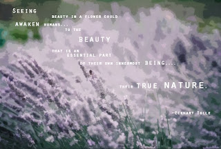
This is an example of the basic first steps into using typography. Using a simple semi-opaque cutout filter for an artistic edge on the lavender garden image I took while in France. Using an image that has the sort of layout and space for text is the starter, and then using some filters helps make the text stand out as well. I used a favorite quote out of Eckhart Tolle's book, A New Earth.

Project 5: Masks?


Here is my first project in masking. Wow did it take a while to finally come up with something decent...key tip: use a photo with a simple background, or else you will be spending days on selection. I honestly can't explain how to do it except the basic steps, but actually accomplishing the desired look is based on trial and error. I will come back to explain later, but for now, on to the next project! :)

Saturday, July 10, 2010

Project 4: Color Matching


In my color scheme project, I used the color match tool to blend in my little furry friend with our girl's night at the Red Room in Santa Cruz. I thought it would be funny since my friends aren't as fond of the guy as me ;)
In order to do this, I chose two images, one of Axil, my fur baby, at the beach, and the other image of our night. The Red Room has red lighting in it, so I thought it would be perfect for the color match. I then cut out axil using the quick selection tool, and refined the edges. After a little nip and tuck to Ax, I nestled him into the chair at the table. After this, I went to the Image/Adjustment menu and while having Ax's layer picked, selected match color. I selected to match color from his layer to the background layer with the girls, and he turns bright red! I then adjusted the Fade and Luminance option til he was just right, and in a separate layer, added some text to form a dialog.

Project 3: Colorizing a Grayscale Image


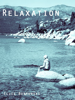
This is the colorized image I made from a grayscale one. To achieve this, I chose a black and white photograph, and reverted it to a RGB mode. After this, I adjust the hue/saturation by clicking the colorized box. With this, I experimented with various hues to see the results of changing this factor. Altering my images hue and saturations then made my image a duotone, however I wanted to go further. I canceled the adjustment, and opened up the Gradient map command located in the adjustments menu. After toying with the more psychedelic looks, none of them fit the relaxed, meditative, serene state I felt when taking the photo. I then selected the "tropical waters" gradient, clicked Ok to apply it, and hello blues and greens and a tranquil look!
One of the things that are different about using color gradients versus the duotone option is that although there is an option for duotone within color gradient, color gradient expands further allowing you to use multiple color tones to achieve the desired look. For instance, you can use an option of four colors, making the image a quad-tone, and then making each color have a different intensity, based on what you'd like the image to turn out as. Above I used the 'tropical waters' gradient, which is a combination of blues, greens, white and black. I thought it was appropriate for this image of me in Tahoe because it is so blue and clear it looks tropical if you are just looking through the glass-like water at your toes digging into the sand, but then the crisp temperature wakes you up from thinking about the Caribbean… :)

Friday, July 2, 2010

A little fun......


Here is a couple images I made for fun and a fan page to promote a local bar. It shows the versatility of photoshop. In addition to editing your pics to make them look better, photoshop can be used for editing graphics, which come in handy when making a website or ad.


Project 2: Merging and Duotones


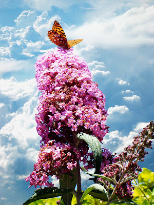
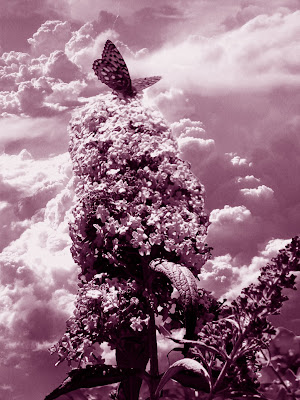
With merging layers, I cut out part of an image and place it onto another forming one image as shown in the photo on the left. Then as the next step in this project, I experimented with different adjustments in color. This is just one of many adjustment types you can do on photoshop. Today I learned about duotone, which is a binary colored image just using black and pink (or any color you choose) as shown in the picture below.

DUOTONE

In my findings of researching duotone, I was coming up empty as far as anything more than a definition. I however did finally stumble across some history on duotone prints, and where they came from. The evolved off of the Cyanotype, a print that had a blue hew and was the original term, 'blueprint'. This was a photographic printing process that used light and chemicals to produce an image of something, or a copy. Duotones also came from 'halftone' prints as well. Halftone prints take a binary color approach to images using filters.
As far as recreating this affect in PS, I found countless sites contributing to the teaching of the process. In searching, I found this great guy(http://www.revellphotography.com/blog/2009/12/give-your-black-white-images-a-different-look-with-duotones/), an awesome resource of quick clips on how to help people with photoshop. I liked his approach because it was pretty simple, and easy to follow. In creating a duotone affect, you simply have to make your photo black and white by desaturating it. After this go to the PS menu bar and select IMAGE, go to MODE, and scroll down to select GRAYSCALE. You can't select DUOTONE without the photo being grayscale. If this is a permanent alteration, select FLATTEN. Then repeat by going to MODE and then click on DUOTONE. You then have the choice to experiment with any colors to create the look you desire.


Project 1: Resolution


In our first assignment we had to change the size and resolution of an image. Here is what I came up with...Above is the downsized photograph of the one I had. The original photograph was too large, and would not be uploaded onto the blog! This is an important (although basic) concept to know because websites sometimes only support certain sized photographs. On the other side, if you have a stellar photograph you would like to have printed on a large scale, pixilization could show and make your photograph's pixels large and apparent. In order to do this, you must go into your PS menu and select IMAGE, then go down to IMAGE SIZE. This then should pop up a screen that allows you to alter the size and percent you would like to downscale or upscale to. It's all in your hands :)

Welcome!

Hello,
My name is Ellie and I am currently enrolled in a photoshop class. I am using this blog to show my work and write about my journey through CS4 and CS5. Stay tuned!